Rolex does not announce revisions, publish change logs, or label generations. Yet few watch brands evolve as continuously. Over the lifespan of a reference, Rolex refines colour, materials, printing, and mechanics in small, deliberate steps. Collectors refer to these quiet evolutions as “marks”—unofficial designations used to distinguish one production phase from another. These marks explain why two watches sharing the same reference number can look, feel, and trade very differently. Understanding them is now fundamental to modern Rolex collecting.
Rolex “Marks” Explained
Rolex is often described as a brand that never changes, but collectors know the opposite is true. Rolex evolves constantly—quietly, deliberately, and without announcement. These incremental changes, often invisible to the casual buyer, are what collectors refer to as “marks.” A mark is not a new reference, nor a limited edition. It is a moment in time when Rolex adjusted something: a dial colour, a bezel tone, a font, a hand shape, or an internal component. Over years of production, these moments accumulate, turning a single reference into multiple distinct generations.
Because Rolex does not publish revision histories, marks are identified retrospectively. They are discovered by comparing hundreds of examples across known production periods, noticing patterns in colour, printing, construction, and finish. What emerges is a quiet evolution that explains why two watches with the same reference number can feel fundamentally different on the wrist.
Examples of Rolex “Marks”
Rather than speaking in abstract terms, the clearest way to understand Rolex marks is through specific examples, below.
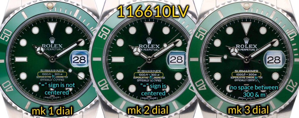
How to identify Submariner 116610LV “Hulk” Dial Mk1 vs Mk2 vs Mk3
Early Mark 1 Hulk dials, found on watches from roughly 2010 to 2015, can be identified by how the depth rating is laid out. In “1000ft = 300m,” the equals sign sits evenly between the two measurements rather than favouring either side. The letter “f” in “ft” is also short and compact, with a noticeably stubby vertical stroke. Together, these two details define the earliest Hulk dials.
Mark 2 dials, which appear briefly around 2015 to 2016, look very similar at first glance but introduce a small printing change. The “f” in “ft” remains short, but the equals sign shifts slightly to the right, breaking the perfectly centred alignment seen on earlier dials. This makes Mark 2 a transitional version that requires closer inspection to distinguish.
With Mark 3 dials, produced from around 2016 until the Hulk was discontinued in 2020, the changes become more obvious. The equals sign moves even further to the right, and the “f” in “ft” is redesigned with a taller, elongated shape. This longer “f” is the quickest and most reliable way to identify a Mark 3 dial, even without side-by-side comparison.
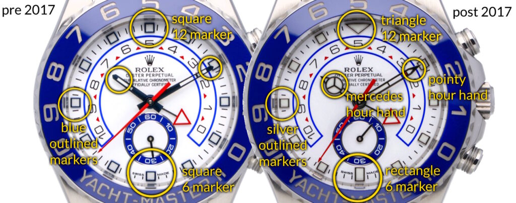
How to identify Yacht-Master II 116680 Pre-2017 vs Post-2017 Versions
The Yacht-Master II is one of the clearest examples of a Rolex model splitting into two distinct dial generations under the same identity. Around 2017, alongside the introduction of the calibre 4161, the dial layout was subtly revised. While the overall design remains unmistakably Yacht-Master II, several specific elements changed in ways that are easy to identify when viewed side by side.
The most obvious difference is the 12 o’clock marker. On pre-2017 dials, the marker is broader and visually heavier, contributing to a more crowded upper dial.
A second clear change appears at on the hands, where the post-2017 version has mercedes style hour hand (circle with the 3 lines on it) prominently displayed.
A third clear change appears at 6 o’clock. Earlier dials use a rectangular marker, while later dials switch to a squarer form.
Beyond the markers, there are minor refinements to dial text and printing. On post-2017 dials, the text appears slightly cleaner and more evenly spaced, contributing to a calmer overall layout. Also the hour markers have a different border, where pre-2017 has blue outlined hour markers, post-2017 has silver outlined hour markers. Lastly, the seconds hand on the post-2017 version is much pointier.
GMT-Master II Ceramic “Pepsi”: Bezel Colour Marks
The ceramic Pepsi bezel is a textbook example of how manufacturing refinement creates unofficial marks. Early ceramic Pepsi inserts exhibit noticeable variation in red and blue balance. Some early examples show darker, almost burgundy reds and muted blues, while others lean brighter and more saturated.
These variations occurred as Rolex refined its ceramic sintering and colour separation process, which is especially complex when producing a two-colour ceramic component. Over time, colour consistency improved, and later bezels tend to display a more stable, evenly divided red and blue with sharper transitions.
Identification focuses on bezel tone rather than dial or case. Early marks often appear warmer or darker, while later inserts look cleaner and more uniform under neutral lighting.
Daytona 116500LN: Dial and Printing Refinements
The ceramic Daytona may appear unchanged since its introduction, but collectors recognise early and later dial marks based on subtle printing and colour differences.
Early dials are often described as having warmer sub-dial tones and slightly softer printing. The contrast between the black ceramic bezel, white dial, and sub-dials is marginally less stark than on later examples.
As Rolex refined dial printing and lacquer application, later dials became crisper and more contrast-heavy. Sub-dials appear brighter and cleaner, and text edges are more sharply defined.
Identification relies on careful inspection of sub-dial colour and printing sharpness, particularly under magnification.
Sea-Dweller Deepsea D-Blue: Gradient and Text Changes
The D-Blue Deepsea dial introduced one of Rolex’s most complex dial manufacturing processes. Over time, small changes emerged in how the gradient transitions from blue to black, as well as in the execution of dial text.
Earlier examples tend to show a softer, more gradual gradient with less dramatic contrast. The green “DEEPSEA” text can appear slightly less vivid and marginally thinner. Later production improved gradient control, resulting in sharper transitions and more consistent colour saturation.
Identification involves comparing gradient intensity and text weight, especially the green “DEEPSEA” line.
Why These Marks Matter
These examples demonstrate that Rolex marks are not theoretical distinctions. They are the visible record of how Rolex refines its watches in real time. Each mark represents a specific stage in production history, shaped by improvements in materials, processes, and engineering.
For collectors, understanding marks affects everything from valuation to authentication. A watch may be fully original, yet still judged incorrectly if its components do not align with its production era. Conversely, recognising a desirable early or transitional mark can significantly enhance a watch’s appeal.
Conclusion
Rolex evolves without announcement. Marks exist because collectors pay attention. What begins as a microscopic change in pigment, printing, or process eventually defines entire generations within a single reference. Understanding those changes is no longer niche knowledge—it is essential for anyone navigating the modern Rolex market.